
Event Explorer
Event Explorer is a powerful insights feature within Lexer that puts customer event data at your fingertips. This tool allows you to analyze customer actions over time—such as orders, products purchased, and interactions—without requiring specialized BI tools, coding knowledge, or assistance from data analysts.
Think of events as a customer action. Each event is a timestamped footprint, giving businesses a view of customer behaviors over time. Unlike static reports, events allow you to track trends, measure engagement, and analyze the real impact of marketing efforts at a very granular level.
Key benefits
- Instant Insights: Query event data and get answers in seconds
- Precise Analysis: Filter by time, product, channel, price, and more
- Time Comparisons: Easily compare performance across different periods
- Visualization Options: View your data in multiple formats for clearer understanding
- Customer-Level Analysis: Track marketing effectiveness at the individual customer level
When to use Event Explorer
Event Explorer is ideal when you need to answer specific questions about customer behavior that go beyond static reports, such as:
- Which products were most popular during a specific sales campaign?
- How does this year's holiday season compare to last year's?
- What's the average order value for customers who purchased through different channels?
- Which store locations are driving the highest customer engagement?
- What products are most frequently purchased together?
Instead of waiting for an analyst to pull custom reports or struggling with complex BI tools, Event Explorer puts these insights directly in your hands.
.webp)
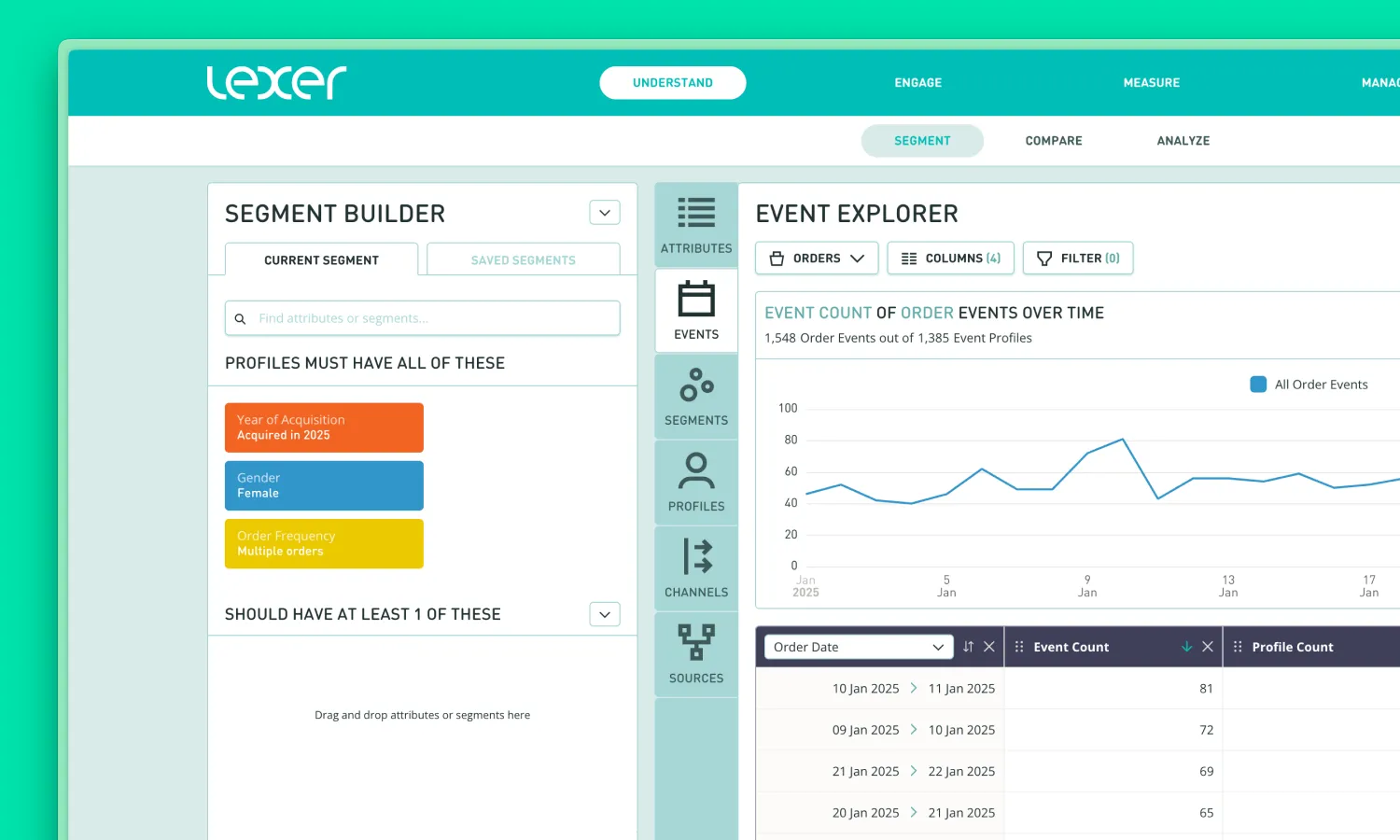
Accessing Event Explorer
Event Explorer is integrated into Lexer's Segment interface, making it easy to analyze event data in the context of your customer segments.
- Navigate to Understand > Segment in the main navigation bar
- Create or select a segment of customers you want to analyze
- Click on the Events tab, which appears alongside the Segment Builder
- Event Explorer will open, showing data for the customers in your selected segment
Relationship with Segment Builder
Event Explorer works hand-in-hand with your Segment Builder searches:
- Event Explorer applies any segment or filter criteria you've set in the Segment Builder (after clicking Search)
- This means you can analyze event data specifically for targeted customer groups, such as high-value customers, recent purchasers, or loyalty program members
- The header displays the number of profiles from your segment that have the selected event type (e.g., "2,356 Product Events out of 1,217 Event Profiles")
This integration provides a powerful way to understand not just who your customers are, but how specific customer segments behave over time.
Working with Events
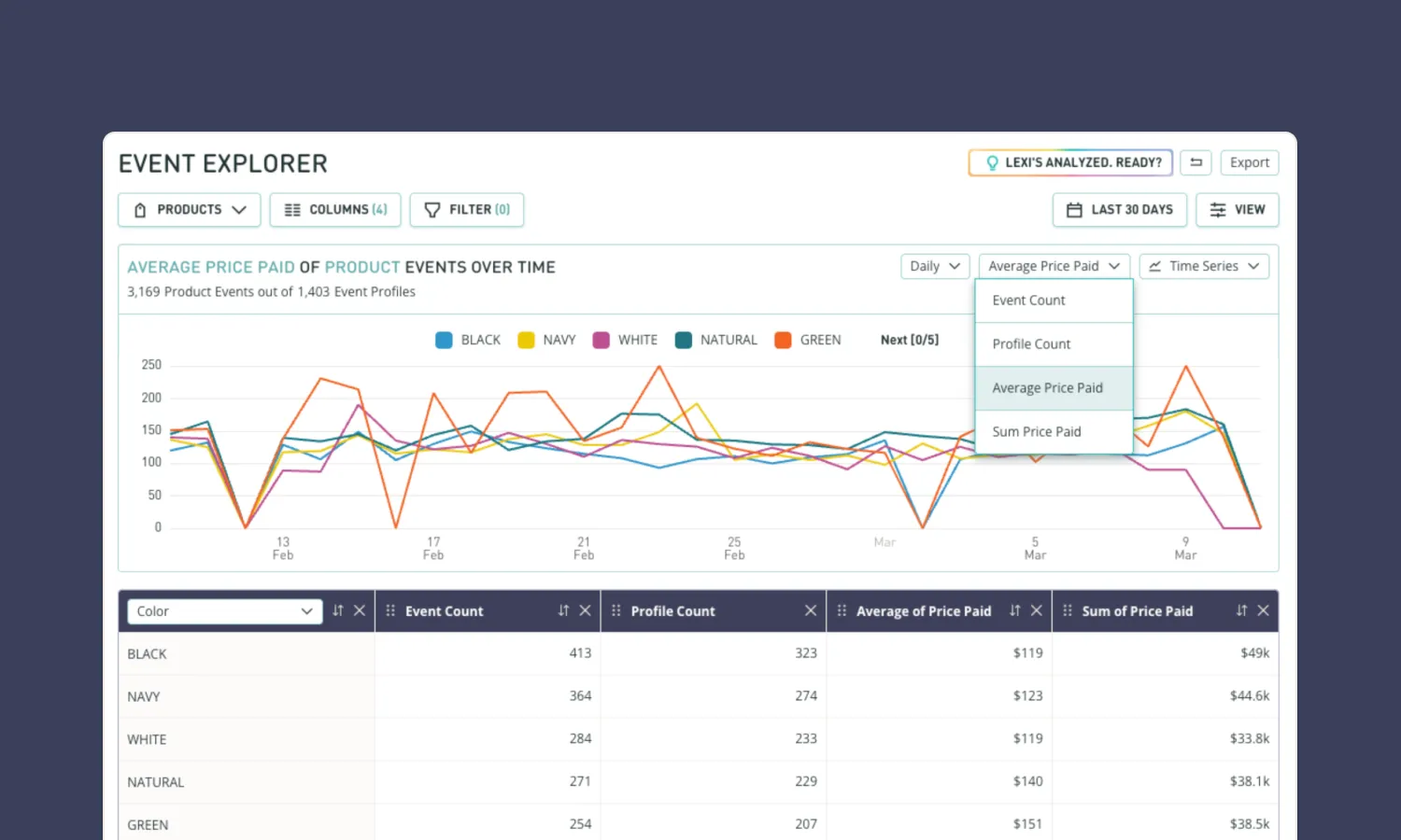
Selecting event types
Use the Event Picker dropdown to select which event type you want to analyze. You will probably have the Products event selected by default. Other event types will vary based on your Lexer implementation (e.g., Orders, Visits, Cases).
.webp)
Filtering
Event Explorer offers powerful filtering capabilities to help you focus on the data that matters most:
- Click the Filter button in the toolbar to open the filter panel
- Select from available fields to filter your results (e.g., date range, product category, order value)
- Apply multiple filters to narrow down your analysis
- The number of active filters will display next to the Filter button (e.g., "Filter (2)")
.webp)
Date range selection
Setting your analysis timeframe is simple:
- Click the date range selector in the top right corner
- Choose from preset options like "Last 60 days" or set a custom date range
- Your analysis will update to reflect the selected period after clicking Apply
.webp)
Understanding data presentation
Event Explorer presents your data in multiple ways:
- Summary Metrics: Key statistics appear at the top of your analysis (Event Count, Profile Count, Average Price Paid)
- Detailed Data: Below the summary, you'll see more granular information based on your selected view
- Comparison Indicators: Green and red indicators show increases or decreases compared to previous periods
- Totals Row: At the bottom of tables, you'll see aggregated totals for the data presented in your table
Each data point helps you understand not just what happened, but also provides context around trends and patterns in customer behavior.
Different ways to view your data
Event Explorer offers multiple visualization options to help you analyze your data.
Time Series view
Time Series view displays your data as a line chart over time, making it ideal for identifying trends and patterns:
- Select "Time Series" from the view dropdown in the summary bar
- The x-axis shows your selected time period, divided into appropriate intervals
- The y-axis displays your selected metric (e.g., Event Count)
- Hover over points on the line to see detailed values for specific dates
Use Time Series view when you want to track performance over time, identify seasonal patterns, visualize the impact of campaigns or promotions, or compare current performance to historical trends.
Metrics view
Metrics view provides a high-level summary of key performance indicators, which is perfect for getting a quick snapshot of overall performance and sharing key figures with stakeholders.
- Select "Metrics" from the view dropdown
- Click the Fields dropdown and select which metrics you would like to display
- You'll see large summary cards displaying your chosen statistics: Event Count (total number of events), Profile Count (number of unique customers), Average Price Paid, and other relevant metrics for your selected event type
Bar Chart view
Bar Chart view allows you to compare performance across different categories:
- Select "Bar Chart" from the view dropdown
- Choose what to group by using the Group By Picker dropdown in the top left corner of the table below the bar chart (e.g., Product Name, Store Location)
- Bars will ordered based on the table sorting
.webp)
Table view
Table view provides the most detailed breakdown of your data:
- Select "Table" from the view dropdown (this is the default view)
- Data is presented in rows and columns for comprehensive analysis
- Sort any column by clicking the arrows in the column header (note: Profile count is not currently sortable)
- View comparison data with percentage changes indicated in green (increase) or red (decrease)
The table view offers the most flexibility for detailed analysis and is particularly useful when you need to export data for further processing.
Getting deeper insights from your data
Event Explorer offers several advanced features that allow you to perform more sophisticated analysis and customize your data view.
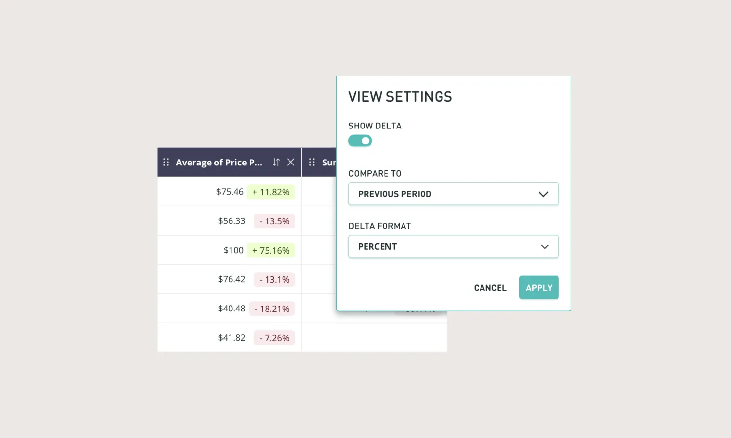
Comparing time periods
One of Event Explorer's most powerful features is the ability to compare performance across different time periods:
- Click the View button in the top right corner
- Toggle the "Show delta" option
- Select your preferred comparison period (e.g. previous period, same period last year)
- Choose your delta format (percentage or absolute value)
- Your data will update to show comparison metrics with increases and decreases highlighted
This feature is invaluable for year-over-year analysis, measuring campaign effectiveness against previous efforts, and identifying seasonal trends.
Customizing columns
You can tailor your view to show exactly the data points that matter most:
- Click the Columns button in the toolbar
- Select or deselect data fields to customize your view
- The number of selected columns appears next to the Columns button (e.g., "Columns (4)")
- You can also rearrange columns by dragging and dropping them in the table view
- Remove a column directly from the table by clicking the X in its header
Changing data aggregations
For numerical data, you can choose how values are calculated:
- Click the dropdown in the column footer (where aggregated values are displayed)
- Select from available options: Sum, Average, Median, Maximum, Minimum
- The column data will recalculate based on your selected aggregation method
Customizing rows and grouping
Shape your analysis by changing how data is organized and grouped:
- Use the Group By Picker dropdown in the top left corner of the table to select which field to use for rows
- For date and numerical fields, you can choose bucketing intervals (e.g., days, weeks, months for dates)
- This determines how your data is grouped and presented in all visualization types
Filtering for specific insights
Create focused analyses by applying detailed filters:
- Click the Filter button in the toolbar
- Select a field to filter on
- Choose your filter criteria and values
- Add multiple filters to narrow your focus further
- Filters affect all visualization types, ensuring consistent analysis
Putting Event Explorer to work
Here are some common scenarios where Event Explorer delivers valuable insights:
Analyzing campaign performance
Evaluate the success of your marketing efforts:
- Set the date range to match your campaign period
- Use Time Series view to track daily or weekly order volumes
- Compare to previous periods to measure the campaign's impact
- Filter by products featured in the campaign to assess specific item performance
- Analyze average order value to determine if promotions affected purchase size
Example: "Our summer sale generated 32% more orders than last year's campaign, with a particularly strong performance from our new activewear line."
Product performance insights
Understand which products drive your business:
- Select Bar Chart view and group by Product Name
- Analyze metrics like event count, revenue, and average price
- Filter by date ranges to compare seasonal performance
- Look for patterns in which products sell together by analyzing customer profiles
Example: "We discovered that our premium yoga pants consistently drive higher average order values and have a strong correlation with repeat purchases."
Store and channel analysis
Compare performance across different locations or purchase channels:
- Use Group By Picker to group by Store Location or Channel
- View metrics like total sales, average order value, and customer count
- Compare current performance to previous periods to identify growth areas
- Identify which stores or channels attract specific customer segments
Example: "Our downtown location shows 15% higher average order values but 10% fewer total transactions compared to suburban stores."
Seasonal trend analysis
Track and compare performance across different time periods:
- Set extended date ranges (quarters or years)
- Use Time Series view to visualize seasonal patterns
- Compare to equivalent periods from previous years
- Identify peak selling periods for specific product categories
Example: "While winter has historically been our strongest season, we're seeing increasingly strong summer performance, with July now outpacing December in total revenue."
Customer segment behavior
Analyze how different customer groups interact with your products:
- Create a segment in Segment Builder (e.g., "VIP Customers")
- Switch to Event Explorer to analyze this segment's purchasing behavior
- Compare to your overall customer base to identify preference patterns
- Use insights to inform personalized marketing strategies
Example: "VIP customers purchase our premium products at 3x the rate of regular customers and are 45% more likely to buy new releases within the first week."
FAQs
How do I access the Event Explorer feature?
All team members in your account with access to Understand > Segment will be able to view the Events tab.
How do I select which events I'm analyzing?
You can select any event in your hub via the "Event Picker" dropdown in the top left corner. The "Products" event is selected by default.
How does my Segment search affect my Event Explorer results?
Any segments, attributes, or events in your Segment Builder search will be overlayed on your event explorer analysis. Your event results will be filtered to just the customers who match your segment search.
How can I reorganize my table columns?
Sort your results by clicking the arrows in any of the column headers. Rearrange columns by dragging and dropping them. Remove columns by clicking the X button in the column header
How do I change which columns are returned in my table?
Click the 'Columns' dropdown at the top of the Event Explorer.
How do I change how the rows are presented?
You can click into the Group By Picker Dropdown in the top left corner of the table to select any field in your event to be used for the rows. When picking a number or date event field, you can choose the bucketing interval (e.g. days/weeks/months for dates).
How do I alter the aggregations displayed at the bottom of the table columns?
You can select from Sum (default), Average, Median, Maximum, and Minimum in the column footer dropdown.
How do I filter my results?
Click the 'Filter' button at the top of the page. Filter by any of the event fields from your selected event. Filter the date range by clicking on the date picker in the top right corner of the page.
How do I show deltas on my table results?
Click the 'View' button in the top right corner of the page and toggle 'Show delta'. You can also select the comparison period and delta format in the window.
How can I visualize my results?
Select various visualization options by clicking the 'Table' dropdown in the top right corner of the summary bar. You can display as Table, Metrics, Time Series, or Bar Chart.
How do I change how the Time Series (line chart) decides which values to chart?
You modify this by changing the event field rows via the Group By Picker in the top left corner of the table. Note: we only currently show the top 5 values (based on sorting option selected) with the ability to show the top 10 by selecting them from the chart legend (“Next [0/5]” button).
How do I export this data?
You can export this data to CSV format by clicking the 'Export' button in the top right corner of the Event Explorer page. Delta values are not currently exported to CSV.
That’s a wrap!
If you need further assistance with Event Explorer:
- Click the "Lexi's here, questions?" button in the top right corner for contextual guidance
- Contact your Lexer Success Manager for personalized support
- Refer to other Lexer help documentation for information on related features
- Participate in Lexer training sessions to enhance your skills
We're excited to see how you use Event Explorer to unlock the full potential of your customer data! If you have questions not covered here, please contact your Lexer Success Manager for additional assistance.
