
Visualize overview
What’s a Visualize Screen?
Teams can spend hours on a Monday morning compiling a social media report from the previous week to be circulated to the business. Visualize replaces that process. With a fully customizable, live social report - you can keep track of what you need to, replicate your regular reporting, and have it display in real-time. What’s more, the link to your screen can be shared with anyone - inside or outside of the business.
So, you’re ready to build a report - which is assuming you’ve already compiled a search, and created a Saved Dive. If not, head over to Listen and do this now.
What do they look like?
Big Screen - large format display
Visualize displays data in real-time with a live rolling feed. If your business wants to understand key metrics, such as volume; types of classifications; influential authors; and a variety of other options, then you can setup a Big Screen for display.
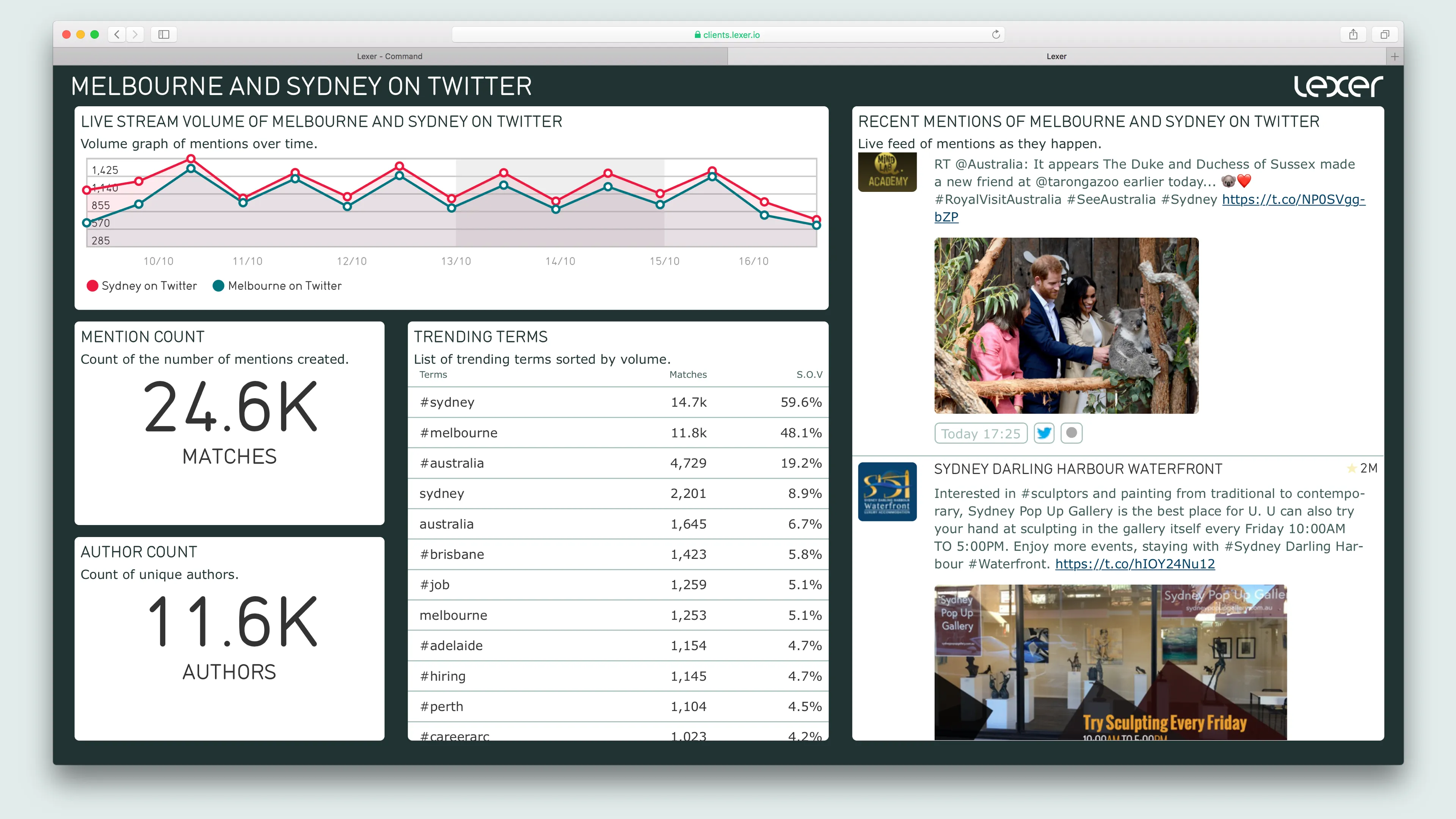
Standard Screen - for everyday reporting
A dynamic reporting tool, displaying real-time changes, and replacing regular, static reporting methods.
What information goes on a Visualize Screen?
Each chart on your Report will display independently, using results from any Saved Dives you choose, meaning each one could show you something different. There are a number of different chart types to choose from - each displaying data from your chosen Saved Dives. Let’s go through them…
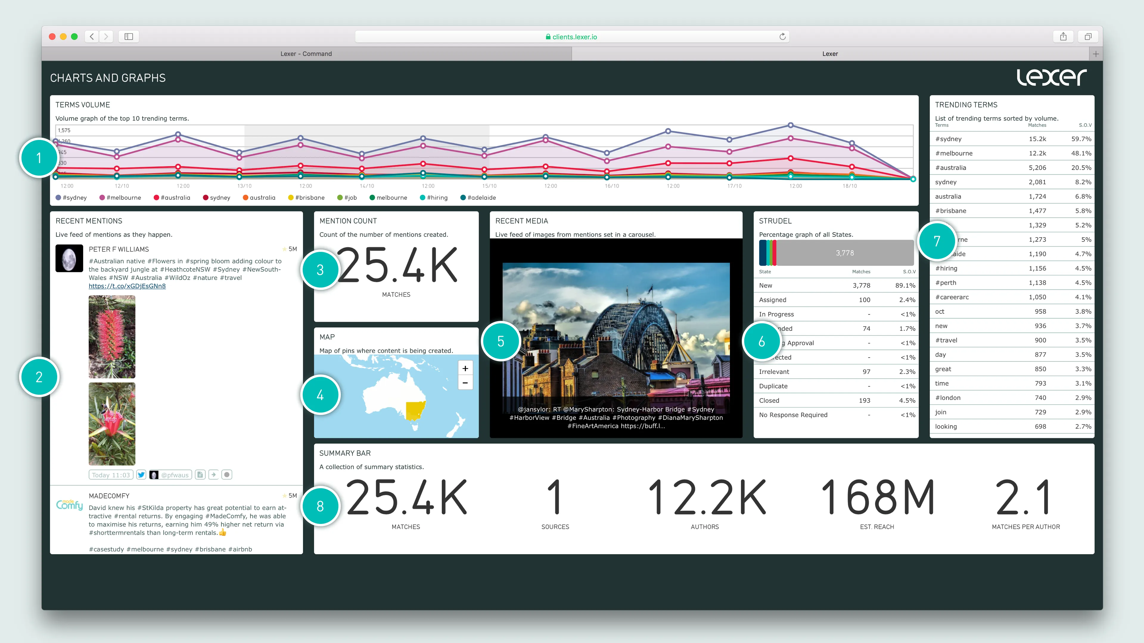
1. Volume Charts
- TERMS VOLUME - Volume graph of the top 10 trending terms.
- LIVE STREAM VOLUME - Volume graph of mentions over time.
- TOP AUTHORS VOLUME - Graph of mentions by the top 5 authors by volume.
- SOURCE VOLUME - Volume graph of sources sorted by volume.
2. Feed
- RECENT MENTIONS - Live feed of up to 100 mentions as they happen.
- INFLUENTIAL MENTIONS - Live feed of up to 100 mentions sorted by the influence of authors.
3. Count Charts
- AUTHOR COUNT - Count of unique authors.
- MENTION COUNT - Count of the number of mentions created.
- SOURCE COUNT - Count of the number of unique sources.
- AVERAGES MATCHES PER AUTHOR - Average number of mentions produced by each author.
- TOTAL REACH - Estimated total reach of the total mentions.
4. Location Chart
- MAP - Map of pins where content is being created.
5. Image Carousel
- RECENT MEDIA - Live feed of images from mentions set in a carousel.
6. Strudel Chart
- STATE STRUDEL - Percentage graph of all States.
7. Top Volume Charts
- INFLUENTIAL AUTHORS - Influential authors sorted by reach.
- ENGAGED AUTHORS - Engaged authors sorted by volume of content produced.
- TRENDING TERMS - List of trending terms sorted by volume.
- TOP SOURCES - List of the top sources sorted by volume.
- SOURCE TYPES - List of the types of sources (e.g. Facebook comment, Tweet, Instagram Post etc) sorted by volume.
- TOP SOURCE GROUPS - List of the top source groups sorted by volume.
- TOP CLASSIFICATIONS - List of the top classifications sorted by volume.
- TOP LINKS - List of the top shared links sorted by volume.
- TOP LOCATIONS - List of locations sorted by the highest volume of mentions.
8. Volume Summary Chart
- SUMMARY BAR - A collection of summary statistics.
How do you make a Visualize Screen?
Easy!
- From the Lexer Hub, head over to Visualize, and hit New Screen.
- You’ll need to give your screen a Name - this should be the thing you’re reporting on.
- There’s an option to leave a Comment - this acts as an internal note, so should be something you’ll use to keep track (like the date), or if you perhaps want to put your name on it.
- Hit Save, and you’re ready to get started.
Now you’re going to populate the screen with a selection of different charts and graphs from the list we just went through. So select New Chart to begin.
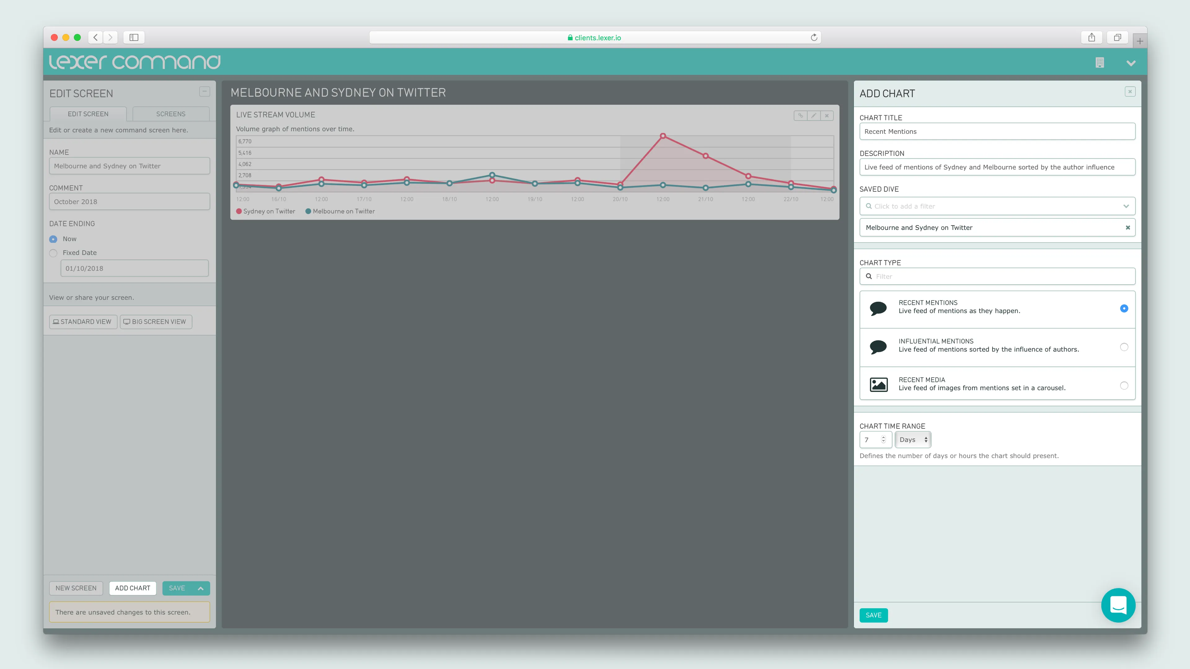
Your new chart will need:
- A TITLE - The type of chart you’re showing.
- A DESCRIPTION - An explanation of the data being displayed in this chart.
- A SAVED DIVE - Select one of your pre-saved Dives from the dropdown menu.
- CHART TYPE - Select how you’d like to display your data.
- A DATE RANGE - The time frame you’d like to report on.
Hit Save, and your chart will be added to your screen.
You can then move it around just by clicking and dragging on the chart, and resize by pulling on the arrow in the bottom right corner.
When you’re done, hit Save again, and voilà - you’re done!
Troubleshooting Visualize
There was an error executing the search. Please try again.
There are a few possibilities as to what’s happening here:
- Date: First of all, check your date range. If you’ve selected a date that’s in the future - no data will populate, and you’ll receive this error instead. Similarly, check that the date range doesn’t exceed 90 days. Lexer Listen, Respond, and Visualize all show content from the last 90 days. If you’d like to see data from beyond this date range, head into Activity, or reach out to Lexer Support (support@lexer.io) to discuss other options.
- Saved dives: Head into Listen, and check that the Saved Dive/s powering your Visualize Screen are actually pulling in content, and make any necessary changes to them here, to ensure the results are relevant.
- Save your work: If you’re testing the screen share view, Curate screen view, or API link view - first make sure you’ve saved your current screen.
Still having trouble? Please get in touch.
- Lexer Support live chat in the Lexer platform.
- Email Lexer Support (support@lexer.io).
