
Report overview
Every day customers turn to social media to tell stories about your brand, and each day, your team user Lexer to listen in, and report on what they find. Our PDF Reports enable you to build simple, beautiful PDFs to share stories, information and key topics across your business. Meaning brand-critical insights can be shared at scale.
What does a Report look like?
A PDF Report is made up of 3 main pages: A summary of content, a focus on specific content, and a glossary of your Report to present to your audience. You can include more pages if required, but we’ll get to that later.
So how does each page display? Let’s break it down…
Page 1 - The Summary
The Summary Page is the “quick overview” of your Report. At a glance, it tells the story of your chosen Saved Dives.
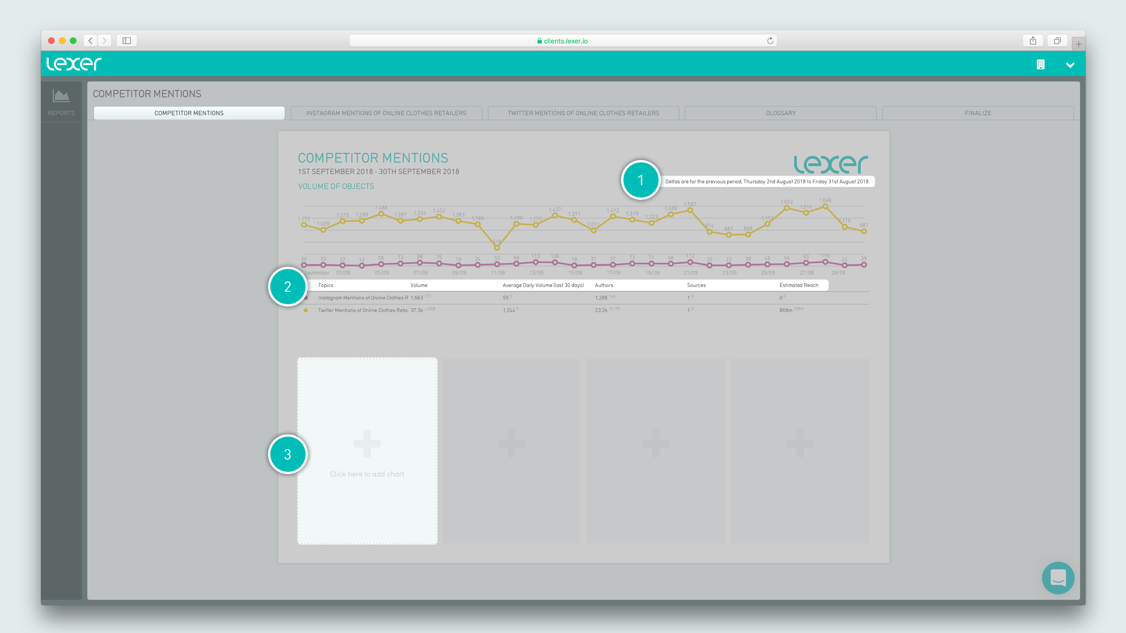
This page will be pre-populated with a chart showing the volume of objects for the time period you’ve selected. We’ll explain the rest a little more detail:
- The deltas
- Metrics summary
- Chart fields
1. The deltas.
Deltas are the same search, but run in the previous time period. So if you run your search for 1 week, the deltas will be for 1 week prior to that.
Deltas are a way to understand the context of your results, because without a comparison, your numbers don’t mean anything.
You’ll see small notations on your graphs and tables - this is to show you what the volume or percentage was for the period prior, so you can compare whether your current period is better or worse than the last.
2. Metrics summary
- Topics - The Saved Dives you’ve chosen to report on
- Volume - How many results were returned from this Saved Dive for the given time period
- Average Daily Volume - The “Volume” metric, broken down into a daily average
- Authors - How many authors that published content in this search
- Sources - The sources your results are being pulled from
- Estimated Reach - The reach of the content. This is an estimated number, based on the follower count of the authors that have appeared in this search.
3. Chart fields
These areas are for you to customize your report. Click on these spaces to select charts that show content relevant to your reporting.
Page 2 - your Saved Dive
For every Saved Dive included in your report, an additional page is created that is used to display the detail on those search results.
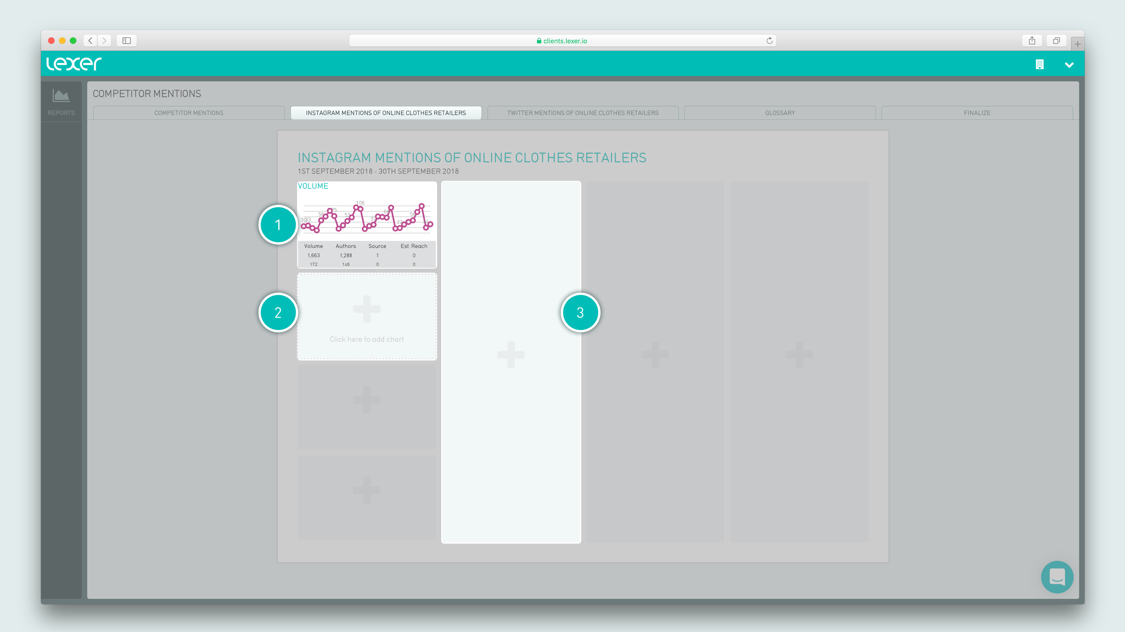
- Volume chart - populated by default, with summary metrics underneath. This is like a mini version of that shown on the Summary page, but specifically for your chosen Saved Dive.
- Blank chart windows - for you to populate with content from this Saved Dive, using your preferred chart type
- Blank “objects” windows - add specific pieces of content here, based on customizable search criteria.
Page 3 (or that following Your Saved Dive pages) - Glossary
This page is a handy guide for your audience, so that they understand the purpose of your charts, and know what the metrics mean.

On the left of the page is a numbered guide to the layout of your Report.
On the right is a corresponding description of each numbered component, followed by a metrics summary, to help define the results and figures you’re seeing.
Last page - Finalize
This is where you end your reporting journey, by turning what you’ve just created into a beautiful PDF.
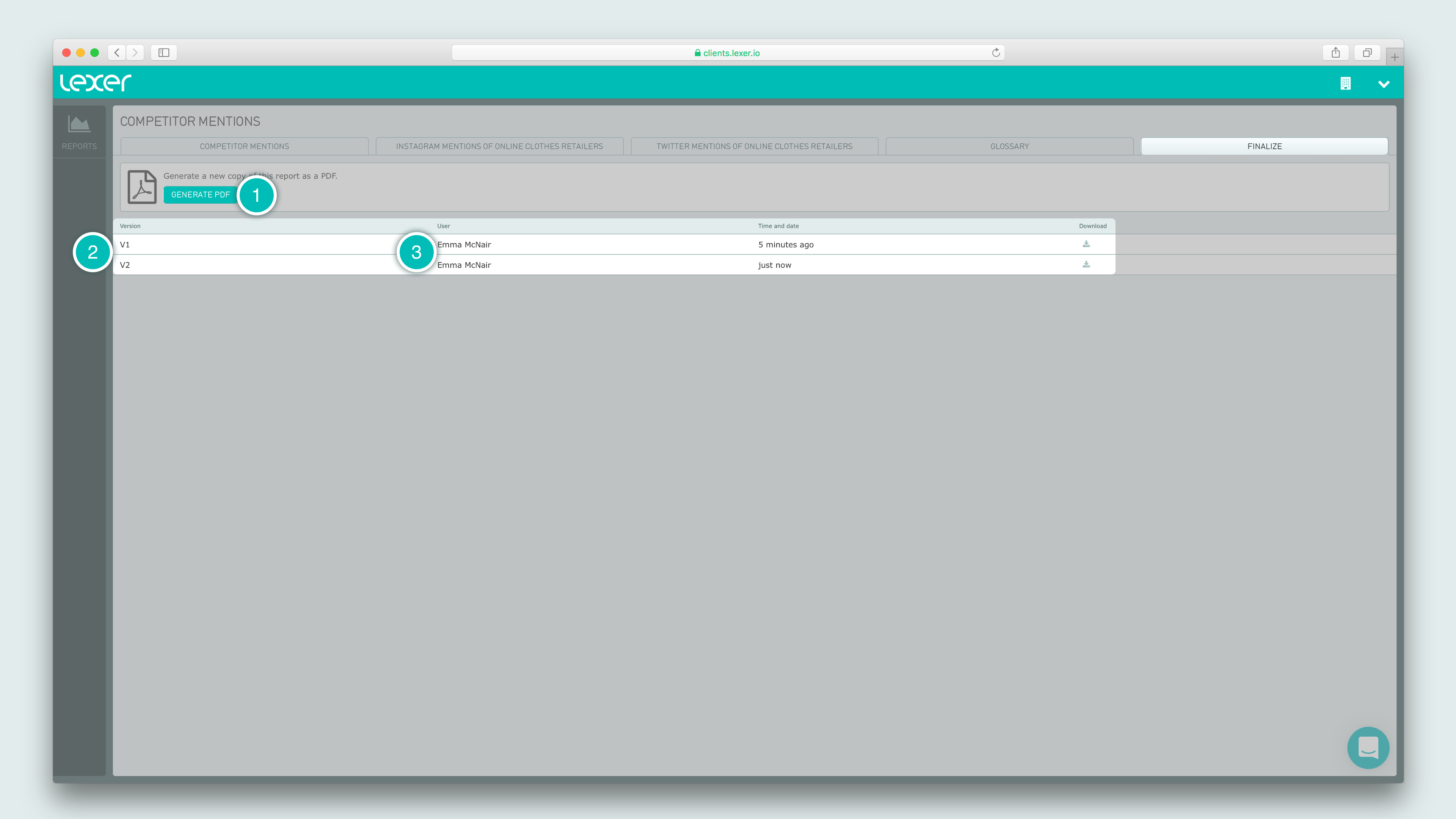
- Clicking the Generate PDF button will do just that.
- Just below that is a list of the PDFs you’ve generated for this Report. Each entry in the list tells you the version of your report - which will update once you’ve gone back to edit a report, becoming V2, V3 or V4 etc.
- You’ll also see who created the Report, as well as the time and date they did so.
Advanced actions
In your “objects” fields on the Saved Dive pages, you have the ability to further narrow down your search, and select only the objects you want from all of the results returned from this Saved Dive.
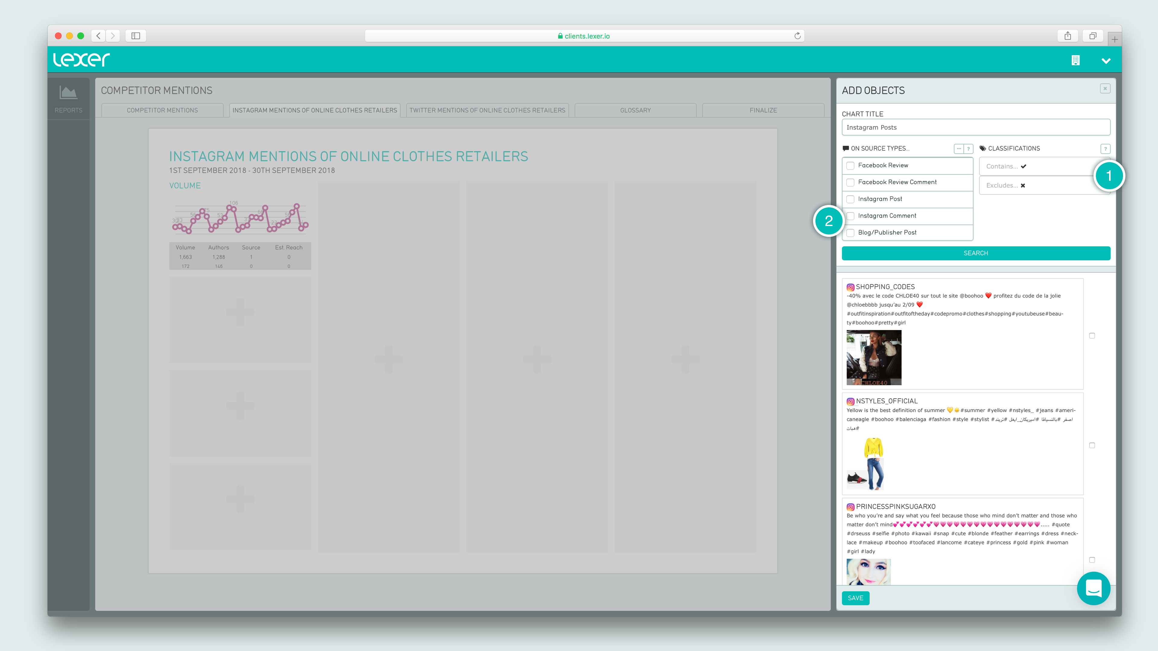
- Using the filters here, you can choose to view only the objects that have been given a Classification, or exclude those that have.
- You can also select your source type - perhaps you only want to see the Twitter comments and blog posts.
These functions are beneficial if the results from your Saved Dive are high in volume, saving you scrolling through hundreds or thousands of results at a time to find the objects you need for your Report.
How to build a Report
You will need to have a Saved Dive to generate a Report from - if you haven’t created a Saved Dive, follow this guide.

To generate a new Report:
- Head into Reports and select New Report.
- Name your Report, select the timezone of the audience you’re reporting to, the timeframe you’d like to report on, and the Saved Dive you’re using to power it.
- Hit Create to generate your Report.
It will take around 30 seconds for your report to populate, and you’ll be presented with a series of pages for you to customize, and display your data the way you want.
When you’re happy with the content in your Report, head to the Finalize Page, and hit Generate PDF. This will add a new PDF to list on this page, which you can download, then either print, or share via the url.
Which charts to use?
On the Summary page, and first portion of your Saved Dive pages, you have a choice of 9 different chart types to populate your Report. Here’s what they do:
